In the second installment of our two-part blog series on the redesign of FORUM magazine, we discuss the graphic design of the publication and how the design choices reflect Association Forum’s foundation and future. Read our first post in the series with Association Forum President Michelle Mason here.
Designing a magazine is about more than just the cover; it’s everything from fonts to grids to colors and all the little graphic themes that make a book cohesive. As Nariman Tahir, art director at marketing communications agency GLC, began the process of redesigning FORUM, she recalled the core values that Association Forum President Michelle Mason stressed at each meeting: welcoming to all, diversity and inclusivity.
One of the first places these values are apparent is the magazine’s new color palette. The colors span the spectrum, including red, orange, yellow, blue and purple, but they lean warm, and each hue is slightly off from its truest version.
“All of the colors are a little off from the typical because we’re trying to reflect diversity,” says Tahir. “They’re warm to reflect FORUM’s welcoming posture.”
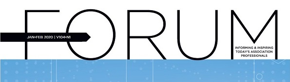
On the cover, the nameplate, or the stylized way the magazine’s name is presented on each issue, got a custom refresh. Previously FORUM’s nameplate used a font whose letters held different weights, and it had a playful, modern connotation. Tahir wanted the cover to reflect the association’s sophistication a bit better, so she chose a geometric, all-caps, sans-serif font whose characters all have equal weight. She added an arrow to the bottom arm of the letter “F,” reflecting FORUM’s progressive philosophy. The angled middle of the “M” points to the magazine’s tagline to draw attention to its importance.
Inside the magazine, content is arranged on a 12-column grid. Tahir says this foundation gives FORUM the flexibility to use a variety of layouts while still accommodating advertising and creating an organized, enjoyable reading experience.
Whereas departments were previously text-heavy and the distinction between unique sections of the book were lightly indicated with small colored headers, now department delineations are bolder, and the text-image ratio is more balanced. Tahir stressed that image selection would continue to be a point of careful consideration for each issue and each piece of content.
“Images should be active, not just a pretty picture,” she says.
Color and imagery do double duty in the new FORUM, serving not just as a visual break from the text, but as complementary elements that call attention to important information adjacent to the main articles.
Tahir also developed some special graphic themes that close readers and Association Forum history buffs can appreciate. To represent the organization’s long, rich history, Tahir uses varied rules made up of horizontal lines, each standing for a mark of time. Look for the lines along the border of features and setting off small blurbs of text.
The old FORUM was a static, one-way experience. Readers could digest its content but had no next step but to wait for the next issue. The new FORUM integrates calls-to-action, giving readers the opportunity to discover more online at the new FORUM website, register for events, get involved in Association Forum and interact with the magazine like never before.